Brand Style Guide — Edition 01
How 26 Care looks, reads and behaves.
A single reference for the wordmark, palette, typography and packaging of the house. Follow it closely; the restraint is the brand.
Logo
The primary lockup is the italic serif 26 above letterspaced CARE, with the Abu Dhabi line as a fixed third row. Never redraw or re-space it.
- Clear space: minimum the cap-height of CARE on all four sides.
- Minimum size: 18 mm wide in print, 96 px on screen.
- Never stretch, rotate, outline, add shadow or recolour.
- Never separate “Abu Dhabi” from the lockup.
Colour
Four tones only. Espresso carries every mark; cream and oat carry every surface.
Espresso
Primary ink
var(--foreground)
Cream
Ground
var(--background)
Oat
Surface
var(--muted)
Stone
Rule / border
var(--border)
Typography
A serif for the voice, a quiet sans for everything functional. No third family.
Display — Cormorant Garamond, light & italic
Ritual-grade masks for restored hair.
Text & labels — Inter / Tenor Sans
Body copy sits at 16–18 px with generous leading. Labels are uppercase, 10–12 px, tracked between 0.25em and 0.5em.
500 ml / 16.9 fl oz
Packaging
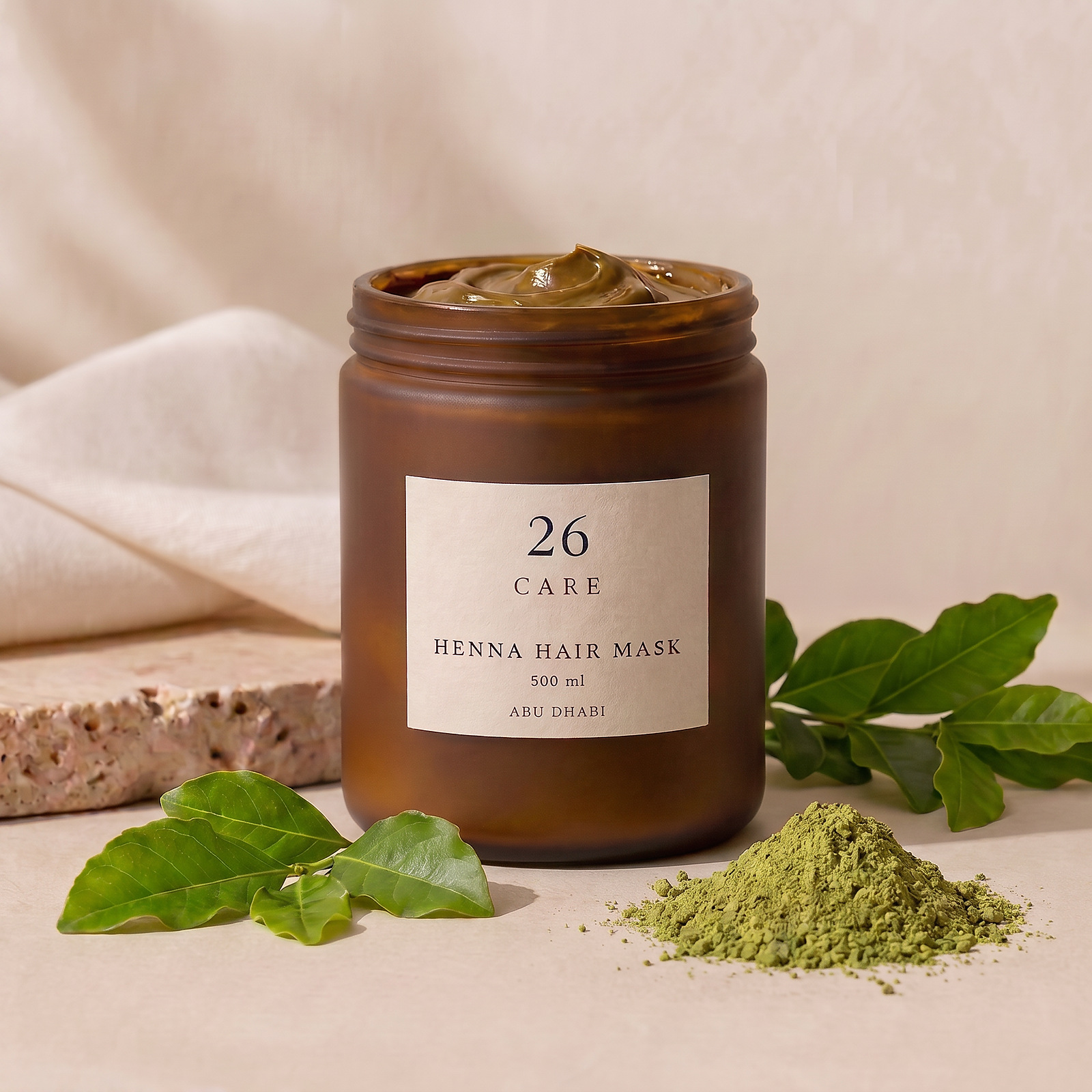
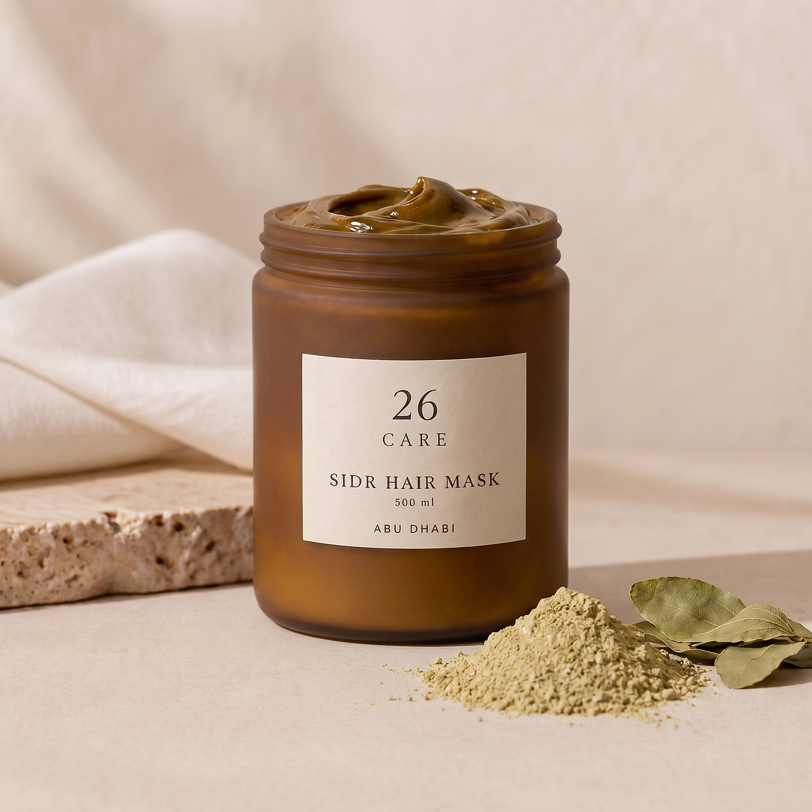
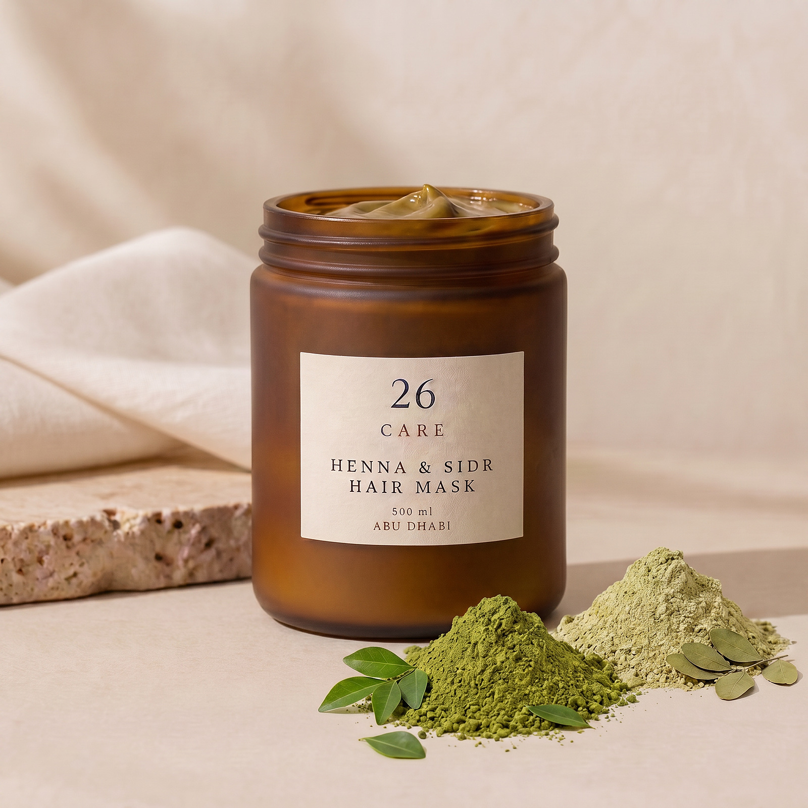
Frosted amber jar, cream label, white lid. The lockup always sits centred in the upper half of the label, with product name and volume below a hairline rule.
Voice
Considered, unhurried, never salesy. Short sentences. Ingredients named plainly.
We say
“A purifying mask rooted in Sidr leaf, for clean, weightless volume.”
We don’t say
“Miracle repair! Transform your hair in 7 days — guaranteed.”